Project Brief
Motivation
We wanted to improve our Docsite in order to make our offering more unified and cohesive. Several products were missing, and it wasn’t clear where to add them in the current site, also it wasn’t clear where to add new content, such as new products or new sections inside a product.
Other problem was that the product’s discoverability wasn’t good enough, and many projects were nested inside other projects (e.g. GSN in landing page).
The team also wanted to use the Docsite to increase the cross-promotion between other OpenZeppelin’s offerings, such as security audits, ethernaut, hiring, and the community forum.
-
Objectives:
- Improve product discoverability
- Add visibility to the learning guides
- Improve user experience
- Increase cross-promotion sections
- References:
- Deadline: Flexible
-
Deliverables:
- New design in sketch
- New product Icons in .svg
- Frontend Implementation
Roadmap
1. Update main menu
We wanted to adjust the main menu, in order to allow us to display more products in a way that all of them were visible. We decided to divide the menu design in two:
- Landing page: Static menu listing all the products and it’s icons
- Product’s page: Collapsible menu listing only the items inside a product
New design:

Old design:
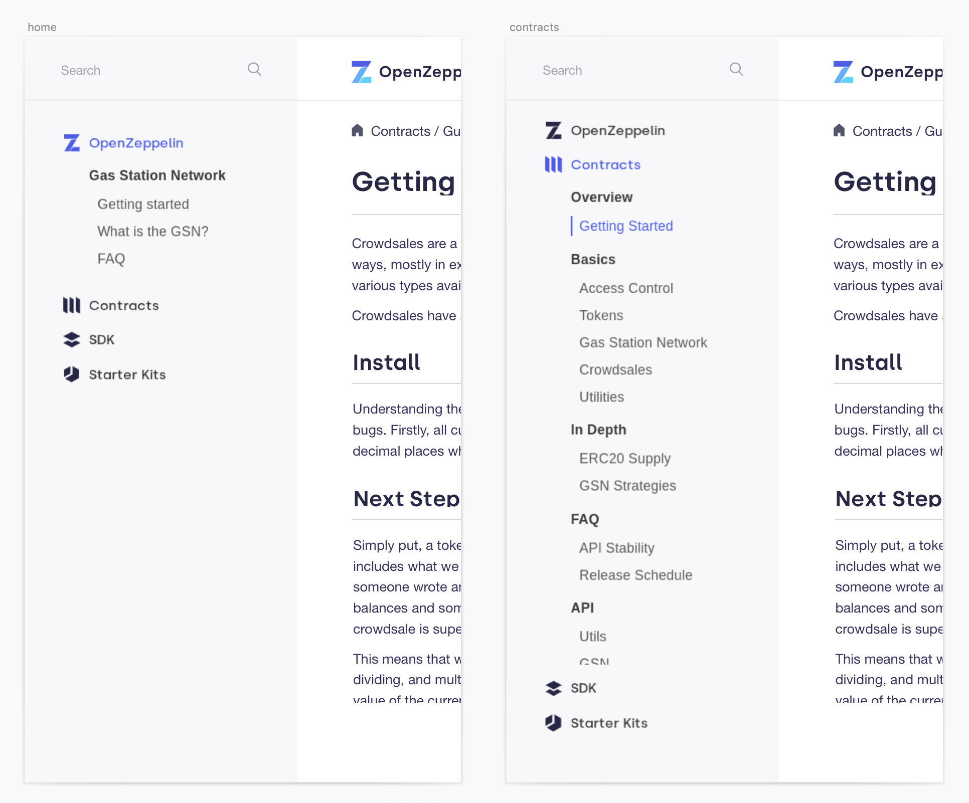
Challenge: I had to learn Handlebars in order to implement the frontend successfully, @frangio guided and helped me a lot during that process.
2. Create icons for the new products
In order to make the products more attractive we decided to create new icons for each one.
We added 8 new icons to the OpenZeppelin family, 4 of them will be updated in the next iteration, we decided to keep them by now in order to have all the Docsite ready for the announcement.

3. Update landing design
We wanted to reorganize and use our landing to redirect the users to different sections from our Docsite, We added a more visual section listing all the ‘Learn guides’ and another one listing all the products. In the future we want to improve the section promoting other OpenZeppelin’s offerings.
Challenge: The frontend in the landing was difficult to implement by two reasons, from one hand, I had to learn AsciiDoc in order to implement the design, and also because that language doesn’t allow much customization, it was difficult to create the linkeable boxes, hopefully with @frangio we could find a way to adapt the design to the language limitations 
Old design:

New design:

4. Cover for announcement
Check out @nventuro’s post announcing our new Docsite!

Next steps
In the next iteration we want to update some icons in order to make them more consistent with our visual brand, in addition, we want to update the section in the landing promoting other OpenZeppelin offerings in a more visual way.
Also, we want to fix and implement the search and a button to edit the page content in Github, those items have a [  ] meaning that they are parked until the team fixes some backend issues.
Roadmap:
- Landing | finish design from ‘More about OZ’ + Implement in frontend
- Product Icons | Update ‘outsiders’
-
[ ] | Fix search
- Think cross-promotion sections [scope to be defined with the team]
- Prepare options + Implement frontend
- Coordinate Illustrations for read mes [to be defined with the team]
- Prepare options + Implement frontend
-
[ ] | Add btn edit GitHub
- Review all outlines in :focus
-
[
 ] | Dark-mode [not confirmed - to be defined with the team]